Aha App - Digital participation of the elderly
Designing a smart assistant to promote digital participation of the elderly

Context
Currently, around 22% of Germany's population, approximately 18.7 million people, are over 65. With society becoming increasingly digital, many elderly individuals struggle to keep up, as digital technology is no longer optional but essential.
Many seniors struggle with unfamiliar interfaces, complex terminology, and the worry of making irreversible mistakes.
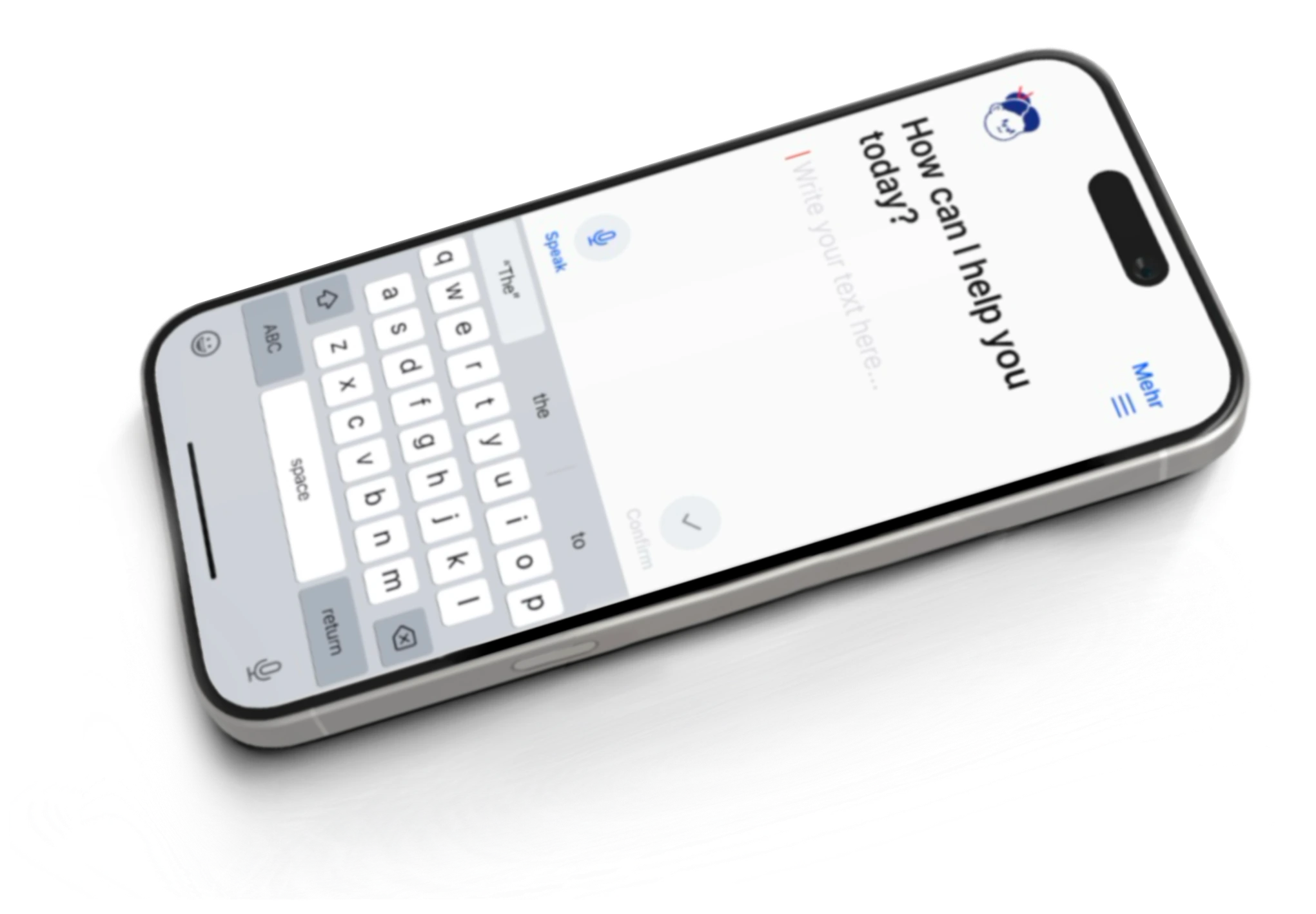
Aha is a built-in digital assistant for iOS and Android devices that empowers older adults to navigate their phones independently, offering always-available guidance, subtle visual cues, and eye-tracking, while preserving privacy through on-device processing.
Research
Data Sources & Methods
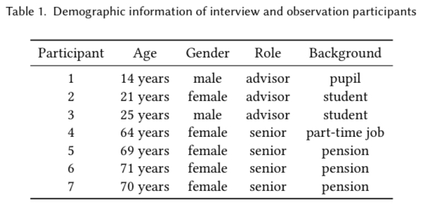
- Field Visits and Observational Studies: Conducted onsite at Pixel's DigitaleHilfe, a volunteer-driven support center for older adults facing digital challenges.
- Semi-Structured Interviews: Spoke with both volunteers and end users to uncover pain points around terminology, iconography, and error anxiety.
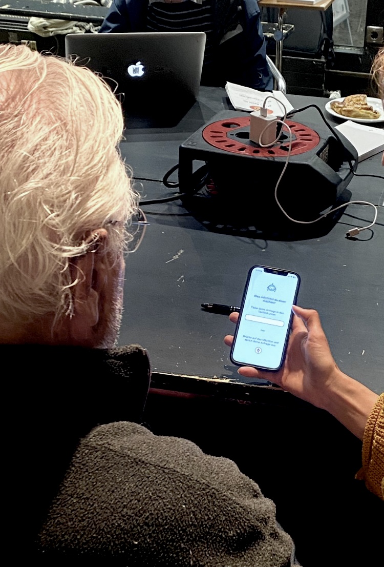
- Prototype Testing: Facilitated hands-on sessions where residents tested early versions of the assistant; feedback focused on clarity of instructions, interface readability, and perceived control.
Users Problem Statements
Through interviews with visitors at Pixel's DigitaleHilfe, a volunteer initiative supporting elderly users with digital devices, we identified key challenges
-
1.
"I'm scared of making mistakes with no way to undo them or not knowing how to go back"
Fear of making mistakes with no way to undo them
-> Anxiety + Reluctance to interact -
2.
"I often don't really know what some symbols stand for and what they do."
Inability to recognize icons or interpret visual cues
-> Visual Conventions aren't inherently intuitive, need to be learned -
3.
"When I click "subscribe" I don't know what that entails and if it will cost money."
Confusion about terminology or unclear instructions
-> Fundamental knowledge on Internet/digital technology needs to be built
Objective
Build Confidence and Independence:
-
Guide each step, keep agencyActions remain in the user's hands, with simple "undo" or "back" options.
-
Learning-by-doing approachAccomplishments foster self-confidence and competence.
Alleviate Anxiety & Errors:
-
Eliminate fear of mistakesClear, concise instructions and persistent recovery options.
-
Less fear encourages explorationFosters greater digital participation by making new features approachable and unintimidating.
Key Features
Persistent Button
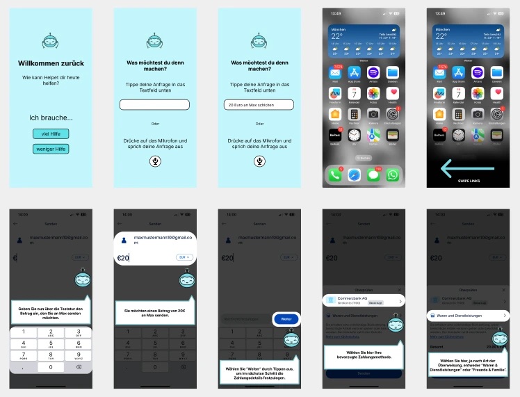
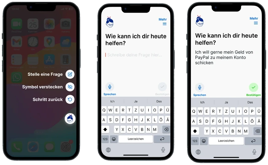
A floating "Aha" assistant icon remains on every screen, ready to offer guidance or revisit previous instructions.
Step-by-Step
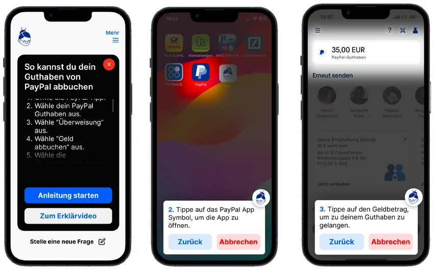
Step-by-Step Guidance: Short, focused lessons introduce fundamental concepts (e.g., launching an app, adjusting volume) with simple language.
Learning
Learning-By-Doing: Instructions prompt the user to act, ensuring real-world practice rather than passive observation.
Eye-Tracking
Eye-Tracking: When users can't follow instructions, the screen gets darkened to guide their interaction, spotlights the right action.
Undo Button
Undo & Back Options: Every guided step includes an immediate way to reverse actions, reducing fear of errors.
Simplicity
Simple Interface: High-contrast text, large fonts, and limited on-screen choices keep distractions to a minimum.
Design Requirements
Restrict on-screen options to reduce decision fatigue and minimize cognitive overload.
Use bold color contrasts and bigger font sizes to accommodate visual impairments.
Prioritize concise and clear, written text instructions over abstract icons; reserve icons for universally recognized symbols only.
Provide a prominently placed "Back" control (Zurück) at every step to reassure users they can easily reverse actions.
Motor skills decline with age, phones are often too small to operate

Security Issues - Privacy by Design
Integrated at the OS level (akin to AssistiveTouch), Aha processes all data locally. By avoiding cloud services and third-party dependencies, it addresses common privacy concerns among older adults and complies with stringent data-protection standards.
Spotlight: Eye-Tracking Assistance
When a user hesitates over an instruction, the assistant's eye-tracking module gently dims surrounding elements and spotlights the target area. This subtle nudge preserves autonomy, users still tap and swipe themselves, but prevents frustration when searching for on-screen controls.
Reflection
Since this was my first bigger project I learned a lot, especially about UX, like conducting interviews and working closely together with the users. Here are some of my key takeaways:
Elderly users are often skeptical; casual conversation before interviews would have led to better insights.
I would focus more on natural, informal conversations in future research to get more emotional insights.
Not every problem needs another app; tangible approaches could be more effective.
Eye tracking and OS-level integration are exciting but currently unrealistic without manufacturer support and strong data protection.
Going through multiple rounds of prototyping and ideation significantly shaped the concept.
Elderly users are often skeptical; casual conversation before interviews would have led to better insights.
I would focus more on natural, informal conversations in future research to get more emotional insights.
Not every problem needs another app; tangible approaches could be more effective.
Eye tracking and OS-level integration are exciting but currently unrealistic without manufacturer support and strong data protection.
Going through multiple rounds of prototyping and ideation significantly shaped the concept.
And if I were to work on this project a little longer, I'd definitely improve the visual identity! I'd focus on refining the logo and branding for stronger presentation.